
Brand Guidelines
This is a guide to the language and design elements that make up Ashley Energy’s identity. It includes advice, templates, and sample executions that demonstrate how to bring our brand to life.
Logos
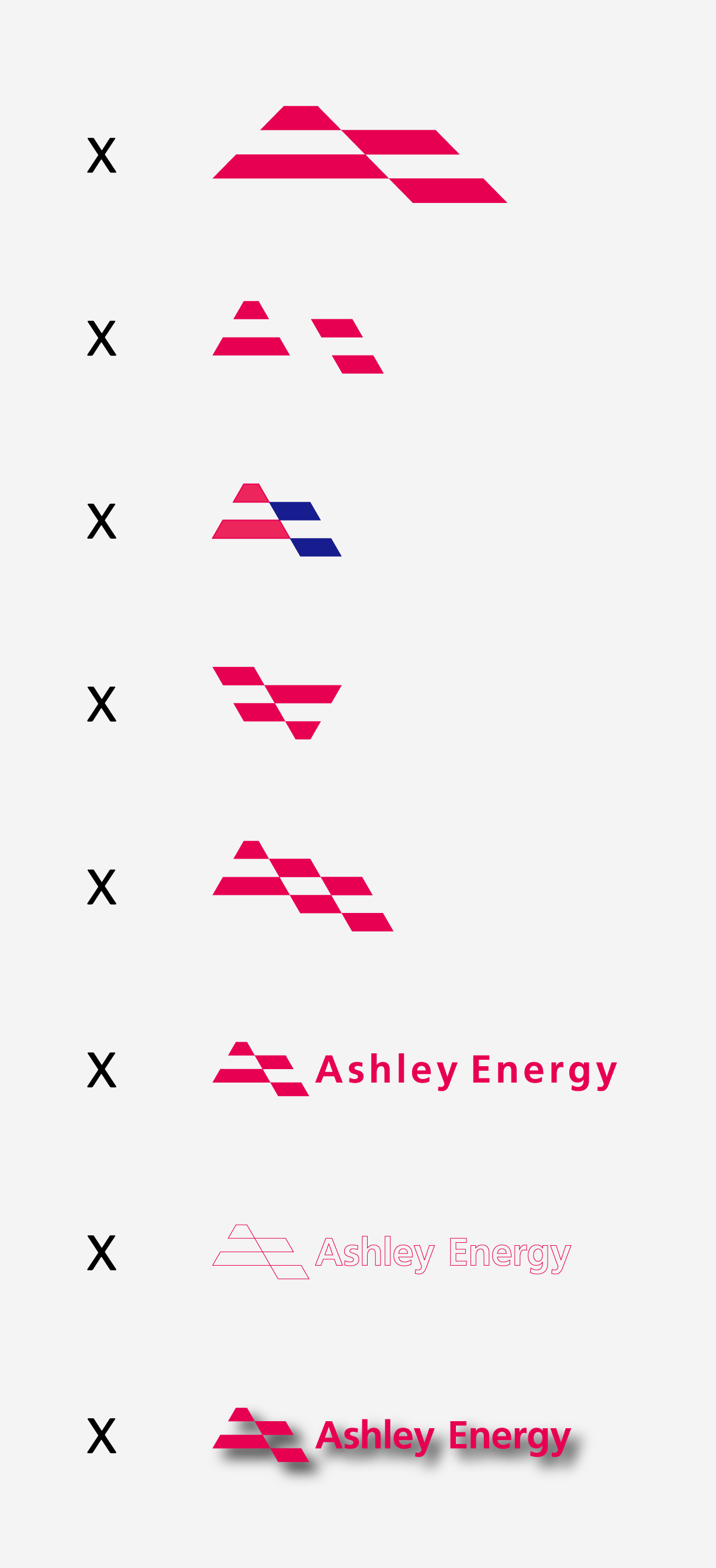
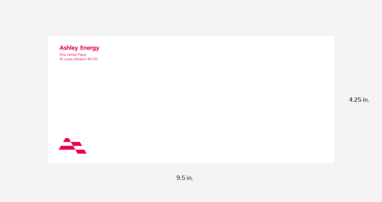
This logo is the guiding post for the Ashley Energy brand. It is our primary logo for all communications.
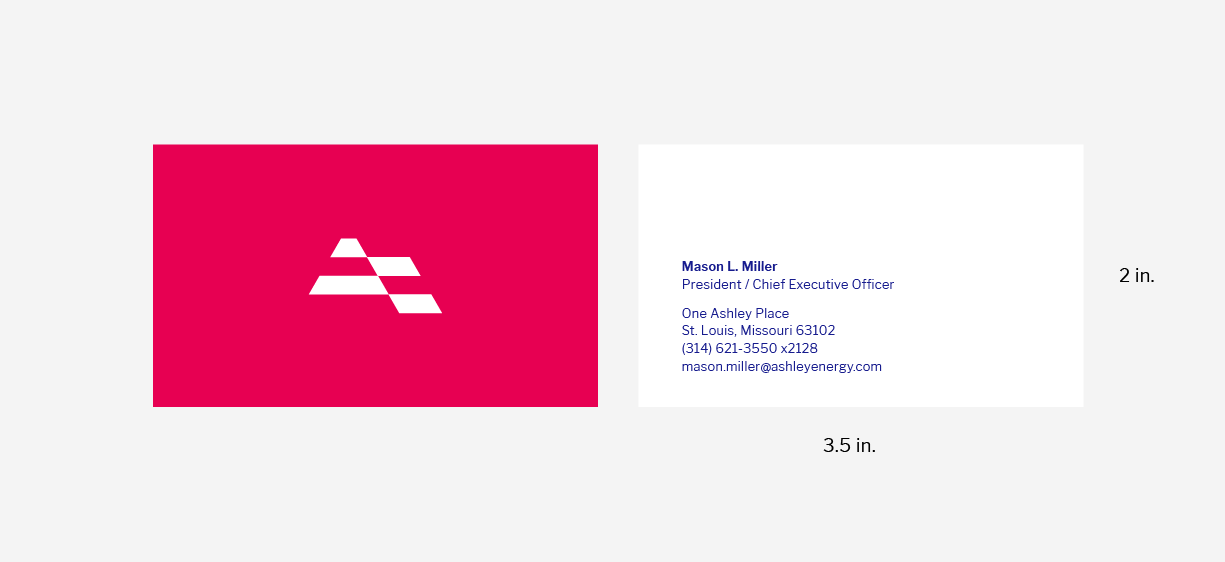
This symbol conveys the future of our work and the character of our organization. It can be used alone in instances in which size is limited or the name is already present.
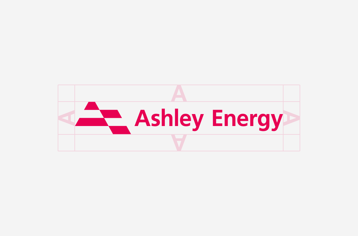
Always keep a standard amount of clear space around the logo, measured by the height of the A.
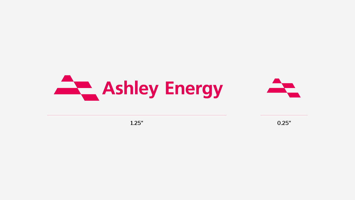
The logo and symbol should never be applied at a smaller size than shown here.
1. Do not stretch or skew the logo.
2. Do not pull apart the logo.
3. Do not color the logo.
4. Do not rotate the logo.
5. Do not add elements to the logo.
6. Do not adjust letter spacing
in the logo.
7. Do not outline the logo.
8. Do not add drop shadows
to the logo.
Colors
Color has enduring emotional appeal. Ashley Energy’s colors are vibrant and strong. By pairing the colors consistently, you can reinforce brand recognition.
Red is our primary color. It should not be used as an overlay or screen. Use blue sparingly as a highlight. Use gray for text and as an alternative to black.

Red
Pantone 1925
CMYK 0 / 97 / 50 / 0
RGB 231 / 0 / 82
HEX #E70052

Blue
Pantone 2746
CMYK 100 / 98 / 0 / 0
RGB 23 / 28 / 143
HEX #171C8F

Gray
Pantone Cool Gray 8
CMYK 23 / 16 / 13 / 46
RGB 135 / 138 / 140
HEX #878A8C
Color works differently in print than on screen, so you’ll need different color codes for each.
Pantone (PMS)
The Pantone system is used for precise color matching – you can give a Pantone reference to any printer, anywhere, and they’ll print the exact same color.
CMYK (Cyan/Magenta/Yellow/Black)
The print files will be delivered in CMYK color mode, which is suitable for commercial full color and everyday printing.
Note: If you try placing a CMYK file into a Microsoft Office program and the image doesn’t display correctly, try the RGB version.
RGB (Red/Green/Blue)
These colors are used in monitors, television screens, digital cameras and scanners. Digital logo files are in RGB color mode.
HEX (Hexadecimal)
This six digit code is associated with websites, viewed on a screen, and refers back to the RGB color.
Typography
Fonts express as much as words. They convey feeling, establishing a consistent and ownable visual language.
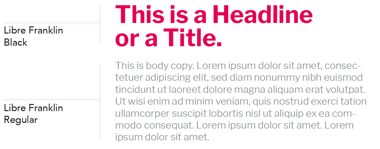
Use Libre Franklin Bold for headlines. Use Libre Franklin Light for subheadings and body copy.
Libre Franklin Bold

Libre Franklin Light

Photography
Intentional photography in a consistent style enhances the Ashley Energy brand. Photos should showcase our history, but avoid hints of decay. Employees should be shown at work.


We use a white, transparent overlay in two ways: knocking out the symbol to reveal photographs or stamping the symbol over photographs. The white overlay is always transparent.

Collateral
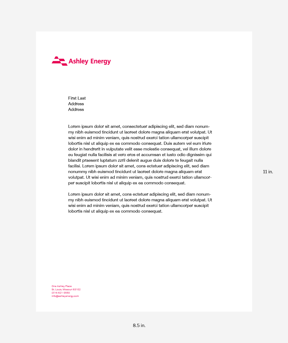
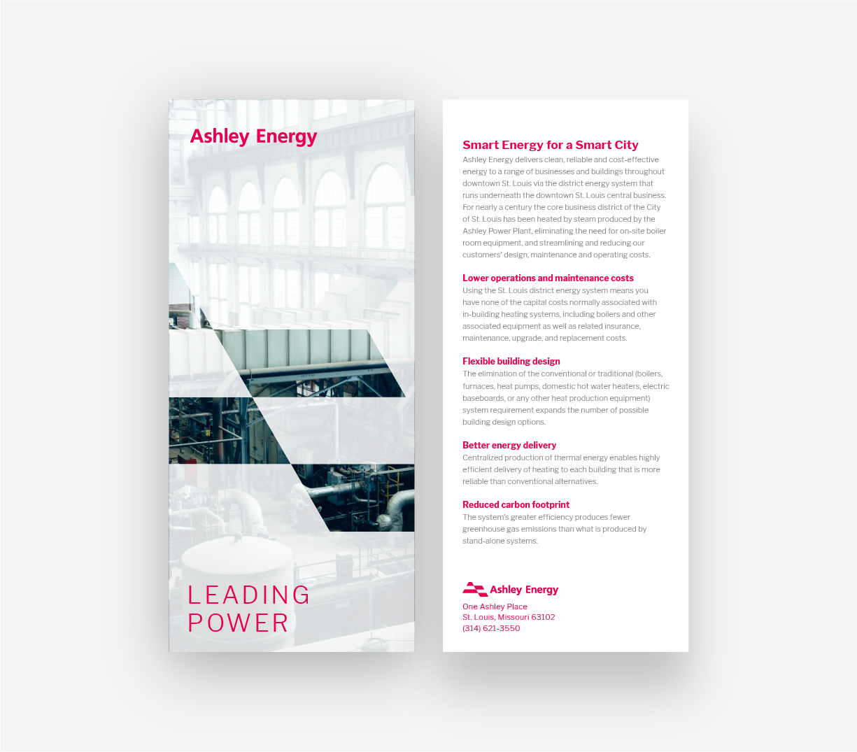
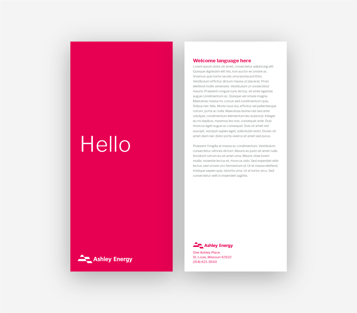
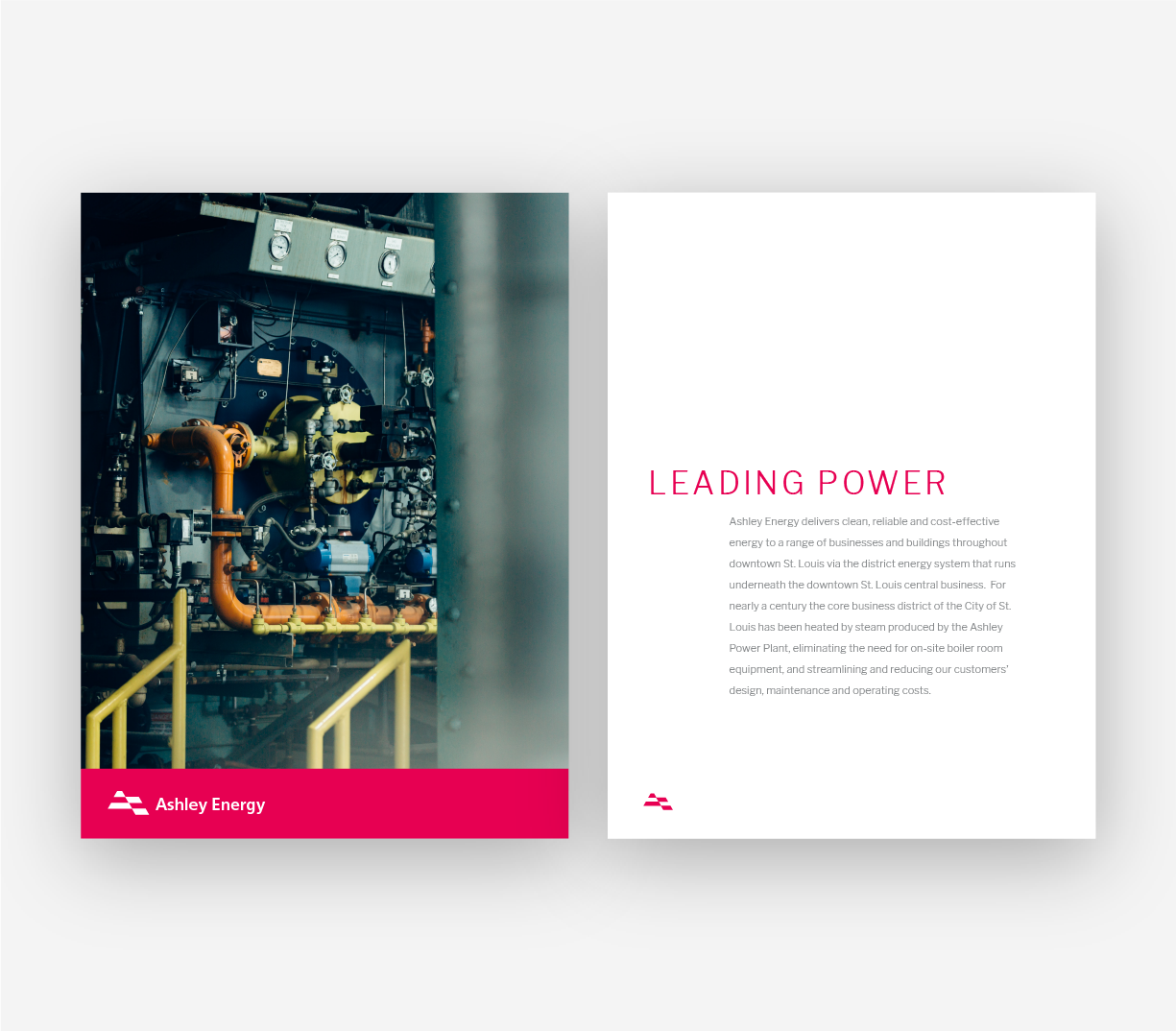

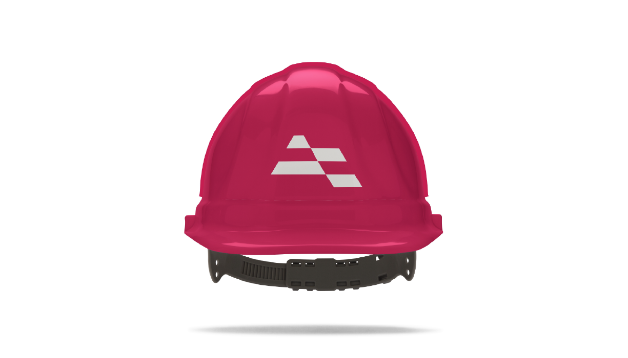
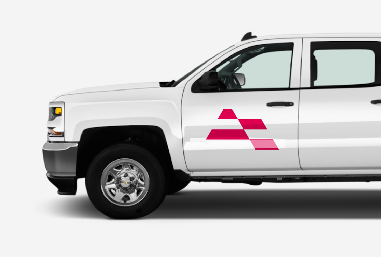
Thank you.
Questions?
Adam Anderson
Vice President of Marketing and Sales
adam.anderson@ashleyenergy.com
314.621.3550
